Chat With Nico: Data, Planning and Design
 Last year we welcomed Nicolas Azel to the evolveEA team with anticipation around how Nico’s data analysis, design and coding abilities could enhance our projects focusing on urban systems. We have found that not only is our design work is better informed, Nico has taught us to develop intriguing visualizations that are helping us and our partners comprehend issues, test solutions and validate design and policy decisions. My background in graphic design has driven my own interest in data visualization, so I’m excited to share this recent conversation about how Nico’s presence has already increased the team’s capacity to leverage data in our consulting and design practice.
Daniel:
Your educational background is in architecture and planning. When did you take an interest in data visualization, and what kinds of skills have you had to learn that were not part of the curriculum in your degree programs?
Nico:
I first became interested in the potential for data to be a highly integrative part of design when I took a class with Kevin Pratt in the beginning of my graduate studies at Cornell University. The focus of the course was on how to create workflows between DIY sensors, programed microcontrollers, and parametric 3d modeling applications. This gave me space to learn some coding and to start managing data in the explicitly visual environment of the 3d modeling application.
Building from there I got the opportunity to work with Dana Cupkova, Kevin’s partner in Epiphyte Lab. Epiphyte lab is an Architecture Design + Research Collaborative and there I got my first chance to cut my teeth with data visualizations for a research project. I can’t say that any of my digital skills were gained from explicit instruction in my curriculum. I’ve learned nearly everything I know how to do on the computer from the internet, and the generous communities that live on forums. That said, I owe significant thanks to people like Dana Cupkova, Kevin Pratt, or Jenny Sabin who run practices or university classes that give me the space and support to explore things on my own and learn as I went. To do data visualization you need to know at least one coding language, usually some associated plug-ins or libraries, and be able to wrap your head around the raw dataset and its implications. These are readily available to anybody with a computer attached to the world-wide web. But perhaps to answer more specifically, I learned ArcGIS, Rhino3d, Grasshopper3d, Java, JavaScript, Python, HTML, and CSS, from brief references in class and many many hours on youtube, stacks exchange, github, and program specific forums.
Daniel:
What are some of the ways you’re using data and computing for our projects?
Nico:
Every project uses these things in some way, but often in different forms and for varying ends. When I approach the project, I like to think about how to best present a given dataset in a visual format that helps users understand it, and possibly make decisions from it. Like I said, the products are always a little different but the Millvale Air Quality Project and the PCRG Busway Futures Study are two fun examples. Some of our Bus Station work is an example of how we use data to better understand space.
Breathe Easy: Millvale Air Quality Data Visualization
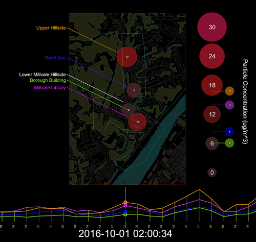
In Millvale, we were working on an Air Quality Report that explained the current state of things in Millville, and the range of considerations residents should have in mind when they think about air quality. We had access to sensor data through Speck . I took this sensor data and combined it with geographic data. Then I generated a video that helped to demonstrate how air quality varies over time and location. I feel that you can be told that these things are true, or shown a graph, but the content means much more when it is communicated across multiple conventions, and within geographic space, as shown in the video. It helps to make the unseen phenomena more present. I must say that after this project, I think about air quality much more.
Busway Futures
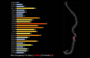
For the Busway project, the Port Authority tracks ridership on several buses. The look at the time the bus arrives at a given stop, how many people get on or off the bus, and how many people are on the bus at that time. I developed a script that allowed us to query a specific stop or a whole bus route over the course of the day, and see the ridership patterns. In each of these it’s a question of creating a visual that triangulates between number of riders, time of day, and location. By visually organizing the information along these categories we could get a better sense of how each route was behaving in the city network, and how each stop is experienced over the course of a day.
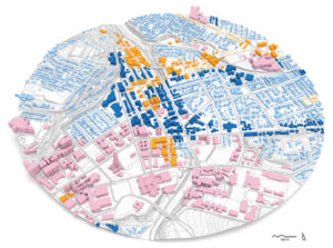
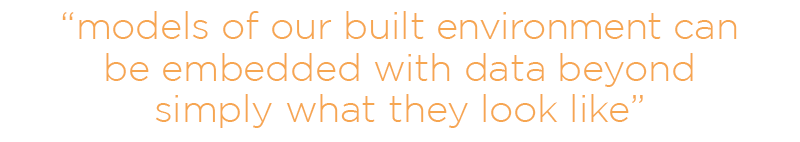
Urban Design
For our urban design projects, we are often making 3d models of a place. More and more, these models of our built environment can be embedded with data beyond simply what they look like. I’ve been working in the background to design workflows that rapidly build 3d models given available GIS data, and embedding these models with information on zoning, real-estate values, and use type.
Daniel:
What are some of the most useful sources of data for planners, policy makers and designers?
Nico:
I think of data coming from three types of sources. First is public records and cross sections, basically government entities from the federal to municipal level. Second is agencies or firms that operate at a high logistical level like power companies, port authority, swear authority. The last is custom or personally gathered data for a specific project or question. The way these types collect data can range greatly with tools like satellites, sensors, surveys, lab tests, or observation.
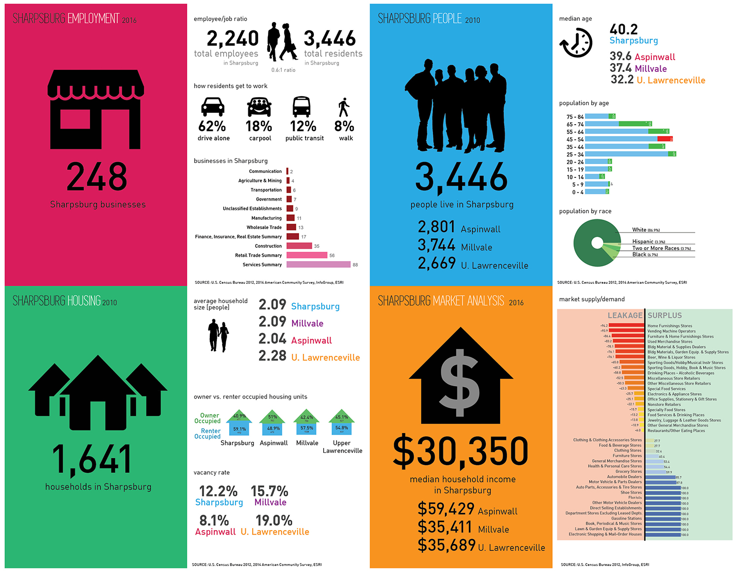
Demographic and market data we presented from our research on Sharpsburg Borough
At the first level, and with respect to local information Western Pennsylvania Regional Datacenter is a great place that brings together data from the city, the health department, the census, and much more. It’s a great place to find organized information based on county district, or neighborhood. Real estate data is also something we use a lot, along with all the layers provided by the city and county about roads, waterways, greenspace, parks and more. Our Penn Carbon web dashboard is an example of the large-scale data being translated into something that could be informative for state policy decisions.
Penn Carbon
Agencies like PWSA or DOT that operate at a high logistical level have a wealth of data that can be useful for planning—there’s a lot of potential to capture and manipulate this data to help inform decision making and you see an example of that with the busway work I mentioned before. With respect to customized data collection, we use a lot of different ways of collecting information in community meetings and we use this to help drive our work. When we collect our own data, it is always catered directly to the question at hand, and often adapts to the desires of a projects stakeholders.
Daniel:
What are some possible new applications of your coding and data viz skills for current and future evolveEA projects?
Nico:
The first thing I would love to see is the implementation of more advanced data collection methods, specifically in relation to community surveys. We now have the ability for people to place points on maps, fill in any information they want, even upload photos. If we could engage a community in this way, possibly over time, we might be able to have a great record of how people use space, and what they think about the places they live. I think given the prevalence of the web we could do a better job of leverage it in new ways, and this might be one of them.
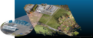
I’ve also been doing some research where I use a drone to survey an area and create 3d digital models. I’m exploring how we might use this for design and planning, or even for monitoring certain places over an extended period. This could be applied to build environment as well as natural systems and there are some cool presidents for this but none of which are fully flushed out yet.
The last thing that comes to mind is that I would like to develop more interactive ways for us to share content and help people understand the information available. I think the New York Times has been doing a great job with this lately and I think we could leverage the same tools for our projects.